Tuesday

The Art Of Staging A Dining Room

The dining room can be a very inviting area. For many it's a place to share meals and visit, but may also be used to do homework, craft projects or play games.

While some use place settings on tables when staging, I usually do not - and here is why. Space allows people to envision the table for whatever activity they enjoy. Also, a table is usually set prior to a meal and not at other times, so I stage for how it may look in daily use rather than "for show". Let's look at two photos of staged dining rooms as examples.

It is common to put an attractive centrepiece on the table, and the first photo shows how this can draw the eye to notice the dining room.


However in the next example there is a spectacular view outside. So a small, low centrepiece was chosen which does not stop the eye at the table. Instead, we wanted potential buyers to notice the view as well as the dining room. The photography also ensures that both the inside and outside are visible for online advertising.


So rather than use a cookie-cutter formula, these photos illustrate how a professional stager works to draw the attention of potential buyers to the unique features of different homes.


Monday

Moving? Your Furniture Could Save You Money

Sellers never know how long their property will be on the market, so opportunities to reduce costs while a house is for sale are welcome. One idea is to let your stager know if you have furniture available to use for staging. Even if you are moving and the house will be vacant, there may be items you could leave and move at a later date. This could reduce the cost of monthly rentals while the house is for sale. Of course not all furniture is suitable for staging, and it's important to trust your stager's judgement about what to use (or not use), since they are knowledgeable about how to make property appeal to potential buyers, and a quicker sale will save you the most.

Shown below is a home where furniture available from the owner was suitable for staging, with rentals and accessories also used to complete the look.


Before

After


How To Sell A "Man Cave"

"Man cave" is a popular term for a room that features the hobbies and interests of the man of the house. But what happens when you are selling - is having a room arranged this way a selling feature or an obstacle?
Home staging differs sharply from home decorating in these cases. The lifestyle and needs of the owners are paramount when decorating, however when staging we first consider the interests of potential buyers, to attract them to purchase the house.
With this in mind, stagers typically return a room to its original purpose. So a family room, bedroom or garage set up as a 'man cave' would be staged to show its original use to potential buyers instead. And since we cannot predict what hobbies or teams buyers will like, sports collectibles are removed and pre-packed to be enjoyed in the owner's next home.
Before Staging: A fun 'mancave' area set up to watch sports and display team collectibles.
After Staging: The family room is returned to it's original purpose. Notice how the green rug accentuates the cork flooring, a selling feature of this home.

Saturday

Revisiting A Home From A Prior Post

A furnished house is a bit like a puzzle. As a stager, I envision how the pieces will look in a completely new arrangement before we even move anything. Then we try the new arrangement, make adjustments, and finish off with accessories and art.
In an earlier post I shared before/after photos of a place we helped clean when visiting an older relative. At that time we organized his trophy collection and books. Sadly this person recently passed away, so we returned to prepare the home for potential buyers or renters. When a house has older furniture and there is no budget for staging, can it still be set up in an inviting way?
Before: Livingroom
In this case, I discovered bedding and pillows that happened to match the area rugs, and used it to cover the older, patterned furniture. Seating was rearranged to feature the large picture window and create a conversation area. The newer recliner had the throw removed, then was positioned where the back would be visible. Also, an interesting aloe plant/book arrangement was put in the former TV corner, and a computer desk replaced the trophy shelf to make the room more inviting to new owners.
After: Livingroom rearranged (using same furniture as the before photo).
Aloe and bookstand arrangement where TV used to be. 
Before: Trophy and bookshelf. Trophies (and even books)
can make a home seem like "someone else's" to a
potential buyer, so we removed them.
After: A computer desk with antique chair shows a potential buyer that technology fits within this house. The dated switchplate on the wall could also be replaced.
 Before: left After: right
If left in poor condition, buyers would assume significant expense was needed to replace the kitchen cupboards. So the goal is to make them clean, updated and attractive enough to eliminate this as a deterrent or bargaining tool for the buyer, and sell the home for a better price as a result.
Years of fingerprints were removed with several applications of Murphy's Oil Soap applied liberally with a damp sponge. Once thoroughly cleaned, updated handles could be added along with new countertops to make the home more saleable. The cupboards could also be painted (or replaced), but a painted finish may not be as durable as the wood has proven to be.

Monday

Why Would a Decorator Hire A Stager?

Architectural design is a key part of any property for sale. Just as people choose clothing, hair styles and makeup to accentuate their best features, good stagers select and arrange items to accentuate the special features of each property they work on.  Attention might be drawn to the quality, detail, beauty, size, view, or functionality of a design, to name a few. This purpose differs from decorating, which may draw attention instead to the personal belongings or lifestyle of the owner. For this reason, even a nicely decorated home may benefit from the focused involvement of a stager when it is offered for sale.
The placement of this furniture deliberately draws attention to the window, an architectural feature of this room. Notice that plants chosen draw the eye to, but do not block the view of, the window.
The flowers are placed to draw the eye through the lovely archway into to kitchen,  but not to detract attention from the renovated cabinets, backsplash, sink, and lighting.


A Solid Improvement

Statistics show most prospective buyers drive by a property before they call for an appointment to view it. So curb appeal makes that crucial 'first impression', and indoor upgrades will not matter if people never view them. The driveway pictured below extends from the front of the house, so cracks that developed over time aged the look of the property and were noticeable from the curb. The problem continued with the patio in the back. Removing and replacing this was not a do-it-yourself project as it required extensive work, and the fence between the houses was also replaced.  But the upgraded look to the property improves the curb appeal immensely and took years off the appearance of this yard.

Driveway: Before
Driveway: After
Patio: Before
Patio: After

Pillow Talk


Extra pillows are often used on beds when staging. This is done to add interest and create a focal point in a way that suggests comfort and luxury. My husband, who occasionally assists with staging projects, has become a bit of a pillow designer lately, arranging the pillows on our bed each day in unexpected patterns. Instead of relying on tried and true pillow arrangements, this reminds me to be imaginative. Here are a couple of his interesting creations.
Unexpected, yet interesting design.

Gives a 'tucked in' look.


Foiled Again

It can be difficult to keep everything shiny in your home for sale while you live there. Although most people only spend a short time at the initial viewing, you don't want their eye drawn to unsightly areas. Stove tops can be particularly noticeable when grimy, and are blackened at once when something spills over and burns. A quick way to brighten a stovetop is to use disposable foil liners over the regular ones. These protect the drip pans and can be quickly replaced. The drip pans and rings themselves can also be replaced, which is more attractive than liners, but liners are very inexpensive and provide a quick solution.

Before: disposable insert is blackened


After: new foil insert replaces old one
Solution: Foil Insert

Friday

Stager On Holidays, Sort Of...

We recently stayed with an older gentleman who lives alone. He loves to read and wanted to display his sports trophies, but his books were piling up and his trophies as displayed, were hard to dust. He consented for us to organize a little. The purpose was not to sell or stage, just to lighten the workload for him and make space for our visit.
A solution was to introduce shelves for his books, and also the trophies. Although a closed unit with glass doors would keep dust off, we used an open unit to make the books very accessible. He was pleased with the changes, and also that the shelves fit on top of his cabinet which he wanted to keep for extra storage.

Before
Before


After

After 


Thursday

Check It "Out"

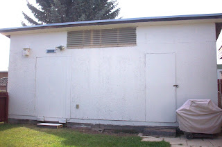
Outdoor buildings can become weathered over time. When you see them in your yard everyday you hardly notice, but they may detract from the appeal of your home and spell w-o-r-k to a potential buyer. Make your shed or garage a positive extra in the sale by keeping it in good repair.

Before
After
Birdhouse detail.

Friday

Natural Colour Palettes

home staging red deer
Inspiration surrounds us in nature. People respond instinctively to the array of colours we see outside. For example, fall leaves have many popular shades used in homes: greys, light browns and tans, soft greens with bluish shades, muted reds, and bolder ones with violet as well. The proportions in nature also give clues about design, with bold colours adding highlights, different shapes for variety, small areas of black and white for contrast, and a unique item (speckled leaf) for a focal point. When choosing a paint colour, consider where it is found in nature, the proportions of it you normally see, and other colours typically found with it.

Monday

Photography For Staging


red deer home staging
Once staged, great photography makes a huge difference in the quality of your online photos. Most buyers today begin their search online, and use the pictures to narrow down the homes they will visit in person. The photo to the left was taken after dark with a 'point and shoot camera', and the flash is unable illuminate the room enough to show off the colors and dimensions. The photo below was taken with a digital SLR camera during the day. The lighting is better, the details are sharper, and a wide angle lens shows off more of this beautiful home.red deer home staging

Tuesday

Timely Touch Ups

Sometimes it is not practical to make all the repairs needed to a property, such as replacing a scratched door. Scratches can be unsightly, and very noticeable when they are lighter than the original finish. To minimize their appearance, furniture touch up products are reasonably priced, and available in common colors. A filler may also be needed for deep scratches, but for light ones simply apply the product like a marker, starting with the lightest shades and blending to darken if needed. The scratch will still exist, but will be less noticeable.

Before
After
Example of furniture touch up product.

Analogous Vs. Complementary Color Scheme

Analogous Colors
 
Analogous colors are near each other on the color wheel. In the photos above the blues, blue/greens and greens used are analogous colors. They produce a harmonious, rich, monochromatic look.

Below, the same room is shown in complementary colors (red and green), which are opposites on the color wheel. They look bright when placed next to each other, and may produce a more lively look.

To influence the feel of a room, keep in mind the affect different color schemes will have.

Complementary Colors


Monday

A Space Transformed - WOW!

The before and after pictures in this example illustrate how decorating and staging can differ. The first photo has a decorative approach, incorporating lively color and special belongings into the decor. Many changes were made to arrive at the new look in the "after" photo.  From a staging perspective, the renovated look would appeal to more buyers because neutral colours are used, complemented by modern fixtures and accessories.
Before
After